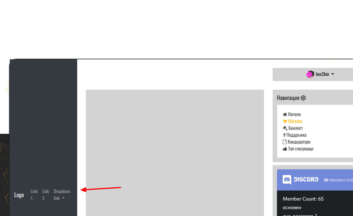
Make bs4 navbar in content box
So i have problem with bs4 navbar so lets explain more about the problem:
I have page with content box that have container and i want above of it to put the navbar i want to make somethink like this 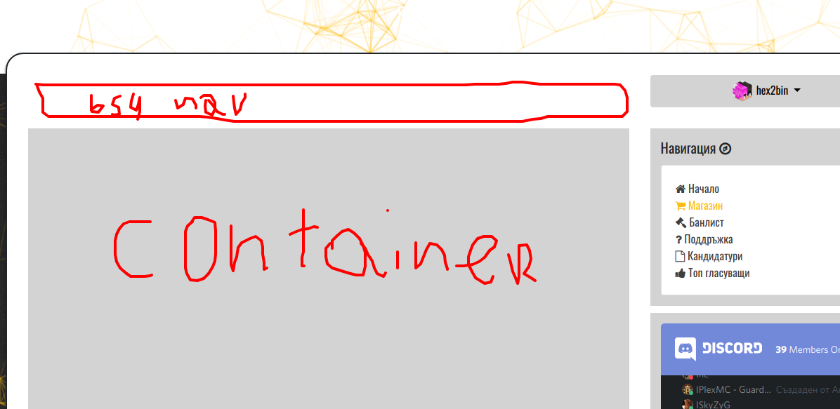
But when i try to make it happend that:
So here is my html file
<title> $title </title>


<!-- CSS -->
<link href="https://fonts.googleapis.com/css?family=Oswald" rel="stylesheet">
<link rel="stylesheet" href="https://maxcdn.bootstrapcdn.com/bootstrap/4.0.0/css/bootstrap.min.css"
 integrity="sha384-Gn5384xqQ1aoWXA+058RXPxPg6fy4IWvTNh0E263XmFcJlSAwiGgFAW/dAiS6JXm" crossorigin="anonymous">
<link rel="stylesheet" href=" asset('css/style.css') ">
<link href="https://stackpath.bootstrapcdn.com/font-awesome/4.7.0/css/font-awesome.min.css" rel="stylesheet">
<script
 src="https://code.jquery.com/jquery-3.3.1.min.js"
 integrity="sha256-FgpCb/KJQlLNfOu91ta32o/NMZxltwRo8QtmkMRdAu8="
 crossorigin="anonymous"></script>
<script src="https://cdnjs.cloudflare.com/ajax/libs/jquery.scrollbar/0.2.11/jquery.scrollbar.min.js"></script>
<link rel="stylesheet"
 href="https://cdnjs.cloudflare.com/ajax/libs/jquery.scrollbar/0.2.11/jquery.scrollbar.min.css"/>
<body class="scrollbar-inner">

<div id="particles-js"></div>
@if(!Auth::user())
 <script type="text/javascript">
 $(window).on('load', function ()
 $('#userLogin').modal('show');
 );
 </script>
 @include('modals.login')
@endif


<div class="servername">
 $heading
</div>
<h1 class="ip" onclick="CopyToClipboard('to-copy')">
 <div id="to-copy"> $main_ip <b class="fa fa-copy"></b></div>
</h1>


<div class="content-box">
 <nav class="navbar navbar-expand-sm bg-dark navbar-dark">
 <!-- Brand -->
 <a class="navbar-brand" href="#">Logo</a>

 <!-- Links -->
 <ul class="navbar-nav">
 <li class="nav-item">
 <a class="nav-link" href="#">Link 1</a>
 </li>
 <li class="nav-item">
 <a class="nav-link" href="#">Link 2</a>
 </li>

 <!-- Dropdown -->
 <li class="nav-item dropdown">
 <a class="nav-link dropdown-toggle" href="#" id="navbardrop" data-toggle="dropdown">
 Dropdown link
 </a>
 <div class="dropdown-menu">
 <a class="dropdown-item" href="#">Link 1</a>
 <a class="dropdown-item" href="#">Link 2</a>
 <a class="dropdown-item" href="#">Link 3</a>
 </div>
 </li>
 </ul>
 </nav>
<div class="maincontent-box">
</div>

 <div class="sidebar">
 @if(Auth::user())
 <div class="dropdown userPane">
 <button style="color:#000000; width: 111%; background: #D3D3D3" class="btn btn-default dropdown-toggle"
 data-toggle="dropdown">
 <img src="http://cravatar.eu/head/ Auth::user()->username/128.png" width="32px;"
 height="32px;"/> Auth::user()->username
 </button>
 <div class="dropdown-menu" style="width: 111%">
 <a class="dropdown-item">
 <center>
 <img src="http://cravatar.eu/head/ Auth::user()->username /128.png" width="32px;"
 height="32px;"/>
 </center>
 </a>
 <div class="dropdown-item">
 <center>
 Репутация: <span
 class="badge badge- Auth::user()->reputation == 10 ? 'success' : 'danger' "> Auth::user()->reputation
 /10</span>
 </center>
 </div>
 <div class="dropdown-item">
 <center>В сървъра ли си?: <b> Auth::user()->isLogged == 1 ? 'Да' : 'Не' </b></center>
 </div>
 <hr/>
 <a class="dropdown-item" href=" url('/account/password') ">
 Смени парола
 </a>
 <a class="dropdown-item" href="#">
 Нотификаций: <span class="badge badge-danger">5</span>
 </a>
 <a class="dropdown-item" href="#">
 ични съобщения: <span class="badge badge-danger">5</span>
 </a>
 <a class="dropdown-item" href=" url('/logout') ">
 <center>Излез</center>
 </a>
 </div>
 </div>
 @endif
 <div class="side">

 <h5 class="boxes-title">Навигация <b class="fa fa-compass"></b></h5>

 <div class="card">
 <div class="card-body">
 <a href=" url('/') " class=" request()->is('/') ? 'active' : '' "><b
 class="fa fa-home"></b>
 Начало</a>
 <br>
 <a href=" url('/shop') " class=" request()->is('shop') ? 'active' : '' "><b
 class="fa fa-shopping-cart"></b> Магазин</a>
 <br>
 <a href=" url('/bans') " class=" request()->is('bans') ? 'active' : '' "><b
 class="fa fa-gavel"></b> Банлист</a>
 <br>
 <a href=" url('/support') " class=" request()->is('support') ? 'active' : '' "><b
 class="fa fa-question"></b> Поддръжка</a>
 <br>
 <a href=" url('/apply') " class=" request()->is('apply') ? 'active' : '' "><b
 class="fa fa-file-o"></b> Кандидатури</a>
 <br>
 <a href=" url('/top-voters') " class=" request()->is('top-voters') ? 'active' : '' "><b
 class="fa fa-thumbs-up"></b> Топ гласуващи</a>
 <br>
 </div>
 </div>

 </div>
 <div class="side">
 <iframe style="width: 300px;"
 src="https://discordapp.com/widget?id=511173991168344069&theme=dark" width="350" height="500"
 allowtransparency="true" frameborder="0"></iframe>
 </div>
 </div>
</div>
<script src=" asset('js/particles.min.js') "></script>
<script src=" asset('js/ptcls.js') "></script>
<script src="https://cdnjs.cloudflare.com/ajax/libs/popper.js/1.12.9/umd/popper.min.js"
 integrity="sha384-ApNbgh9B+Y1QKtv3Rn7W3mgPxhU9K/ScQsAP7hUibX39j7fakFPskvXusvfa0b4Q"
 crossorigin="anonymous"></script>
<script src="https://maxcdn.bootstrapcdn.com/bootstrap/4.0.0/js/bootstrap.min.js"
 integrity="sha384-JZR6Spejh4U02d8jOt6vLEHfe/JQGiRRSQQxSfFWpi1MquVdAyjUar5+76PVCmYl"
 crossorigin="anonymous"></script>
<script src=" asset('js/application.js') "></script>

</body>

</html>
My css file:
body
 font-family: 'Oswald', sans-serif;
 background: url("https://i.imgur.com/CTT4cRp.jpg") no-repeat center center fixed;
 -webkit-background-size: cover;
 -moz-background-size: cover;
 -o-background-size: cover;
 background-size: cover;


a
 color: rgba(0, 0, 0, 0.77);


a:hover
 color: #ffbd13;


.servername
 color: white;
 text-align: center;
 text-decoration: none;
 font-size: 100px;
 display: flex;
 margin-top: 40px;
 justify-content: center;


.ip
 color: white;
 text-align: center;
 text-decoration: none;
 font-size: 24px;
 margin-bottom: 50px;
 justify-content: center;


#to-copy:hover
 cursor: pointer;


#particles-js
 position: fixed;
 width: 100%;
 height: 100%;
 overflow: hidden;
 top: 0px;
 z-index: -1;
 left: 0px;
 background-image: url('');
 background-position: 50% 50%;
 background-repeat: no-repeat;


.content-box
 border-radius: 25px;
 border: 2px solid;
 box-shadow: 0 3px 6px rgba(0, 0, 0, 0.16), 0 3px 6px rgba(0, 0, 0, 0.23);
 max-width: 80rem;
 margin: 0 auto;
 background: white;
 margin-bottom: 20rem;
 display: flex;
 flex-direction: column;
 justify-content: center;


.active
 color: #ffbd13;


.news-box
 background-color: lightgrey;
 width: 90%;
 padding: 15px;
 margin: 30px;


.maincontent-box
 background-color: lightgrey;
 width: 90%;
 padding: 15px;
 margin-top: 6.6rem;
 margin-left: 30px;
 margin-bottom: 30px;


.boxes-title
 padding-bottom: 5px;


.sidebar
 width: 90%; /*Changed*/
 bottom: 520px;
 margin: 30px;


.side
 padding: 15px;
 bottom: 520px;
 margin-bottom: 10px;
 background-color: lightgrey;


@media only screen and (min-width: 768px)
 .sidebar
 width: 30%;


 .news-box
 width: 100%;


 .maincontent-box
 width: 100%;


 .content-box
 flex-direction: row;


.userPane
 margin-bottom: 30px;
 top: 0;
 color: white;
 right: 0;
 width: 80%;
 justify-content: center;


@media only screen and (min-width: 768px)
 .userPane
 width: 90%;
Please help me guys.. im trying to make it maybe 30 minutes without succedd! Thanks in advice!
javascript html css laravel laravel-blade
asked Nov 13 '18 at 19:52
norespectfrnorespectfr
103
add a comment |
So i have problem with bs4 navbar so lets explain more about the problem:
I have page with content box that have container and i want above of it to put the navbar i want to make somethink like this
But when i try to make it happend that:
So here is my html file
<title> $title </title>


<!-- CSS -->
<link href="https://fonts.googleapis.com/css?family=Oswald" rel="stylesheet">
<link rel="stylesheet" href="https://maxcdn.bootstrapcdn.com/bootstrap/4.0.0/css/bootstrap.min.css"
 integrity="sha384-Gn5384xqQ1aoWXA+058RXPxPg6fy4IWvTNh0E263XmFcJlSAwiGgFAW/dAiS6JXm" crossorigin="anonymous">
<link rel="stylesheet" href=" asset('css/style.css') ">
<link href="https://stackpath.bootstrapcdn.com/font-awesome/4.7.0/css/font-awesome.min.css" rel="stylesheet">
<script
 src="https://code.jquery.com/jquery-3.3.1.min.js"
 integrity="sha256-FgpCb/KJQlLNfOu91ta32o/NMZxltwRo8QtmkMRdAu8="
 crossorigin="anonymous"></script>
<script src="https://cdnjs.cloudflare.com/ajax/libs/jquery.scrollbar/0.2.11/jquery.scrollbar.min.js"></script>
<link rel="stylesheet"
 href="https://cdnjs.cloudflare.com/ajax/libs/jquery.scrollbar/0.2.11/jquery.scrollbar.min.css"/>
<body class="scrollbar-inner">

<div id="particles-js"></div>
@if(!Auth::user())
 <script type="text/javascript">
 $(window).on('load', function ()
 $('#userLogin').modal('show');
 );
 </script>
 @include('modals.login')
@endif


<div class="servername">
 $heading
</div>
<h1 class="ip" onclick="CopyToClipboard('to-copy')">
 <div id="to-copy"> $main_ip <b class="fa fa-copy"></b></div>
</h1>


<div class="content-box">
 <nav class="navbar navbar-expand-sm bg-dark navbar-dark">
 <!-- Brand -->
 <a class="navbar-brand" href="#">Logo</a>

 <!-- Links -->
 <ul class="navbar-nav">
 <li class="nav-item">
 <a class="nav-link" href="#">Link 1</a>
 </li>
 <li class="nav-item">
 <a class="nav-link" href="#">Link 2</a>
 </li>

 <!-- Dropdown -->
 <li class="nav-item dropdown">
 <a class="nav-link dropdown-toggle" href="#" id="navbardrop" data-toggle="dropdown">
 Dropdown link
 </a>
 <div class="dropdown-menu">
 <a class="dropdown-item" href="#">Link 1</a>
 <a class="dropdown-item" href="#">Link 2</a>
 <a class="dropdown-item" href="#">Link 3</a>
 </div>
 </li>
 </ul>
 </nav>
<div class="maincontent-box">
</div>

 <div class="sidebar">
 @if(Auth::user())
 <div class="dropdown userPane">
 <button style="color:#000000; width: 111%; background: #D3D3D3" class="btn btn-default dropdown-toggle"
 data-toggle="dropdown">
 <img src="http://cravatar.eu/head/ Auth::user()->username/128.png" width="32px;"
 height="32px;"/> Auth::user()->username
 </button>
 <div class="dropdown-menu" style="width: 111%">
 <a class="dropdown-item">
 <center>
 <img src="http://cravatar.eu/head/ Auth::user()->username /128.png" width="32px;"
 height="32px;"/>
 </center>
 </a>
 <div class="dropdown-item">
 <center>
 Репутация: <span
 class="badge badge- Auth::user()->reputation == 10 ? 'success' : 'danger' "> Auth::user()->reputation
 /10</span>
 </center>
 </div>
 <div class="dropdown-item">
 <center>В сървъра ли си?: <b> Auth::user()->isLogged == 1 ? 'Да' : 'Не' </b></center>
 </div>
 <hr/>
 <a class="dropdown-item" href=" url('/account/password') ">
 Смени парола
 </a>
 <a class="dropdown-item" href="#">
 Нотификаций: <span class="badge badge-danger">5</span>
 </a>
 <a class="dropdown-item" href="#">
 ични съобщения: <span class="badge badge-danger">5</span>
 </a>
 <a class="dropdown-item" href=" url('/logout') ">
 <center>Излез</center>
 </a>
 </div>
 </div>
 @endif
 <div class="side">

 <h5 class="boxes-title">Навигация <b class="fa fa-compass"></b></h5>

 <div class="card">
 <div class="card-body">
 <a href=" url('/') " class=" request()->is('/') ? 'active' : '' "><b
 class="fa fa-home"></b>
 Начало</a>
 <br>
 <a href=" url('/shop') " class=" request()->is('shop') ? 'active' : '' "><b
 class="fa fa-shopping-cart"></b> Магазин</a>
 <br>
 <a href=" url('/bans') " class=" request()->is('bans') ? 'active' : '' "><b
 class="fa fa-gavel"></b> Банлист</a>
 <br>
 <a href=" url('/support') " class=" request()->is('support') ? 'active' : '' "><b
 class="fa fa-question"></b> Поддръжка</a>
 <br>
 <a href=" url('/apply') " class=" request()->is('apply') ? 'active' : '' "><b
 class="fa fa-file-o"></b> Кандидатури</a>
 <br>
 <a href=" url('/top-voters') " class=" request()->is('top-voters') ? 'active' : '' "><b
 class="fa fa-thumbs-up"></b> Топ гласуващи</a>
 <br>
 </div>
 </div>

 </div>
 <div class="side">
 <iframe style="width: 300px;"
 src="https://discordapp.com/widget?id=511173991168344069&theme=dark" width="350" height="500"
 allowtransparency="true" frameborder="0"></iframe>
 </div>
 </div>
</div>
<script src=" asset('js/particles.min.js') "></script>
<script src=" asset('js/ptcls.js') "></script>
<script src="https://cdnjs.cloudflare.com/ajax/libs/popper.js/1.12.9/umd/popper.min.js"
 integrity="sha384-ApNbgh9B+Y1QKtv3Rn7W3mgPxhU9K/ScQsAP7hUibX39j7fakFPskvXusvfa0b4Q"
 crossorigin="anonymous"></script>
<script src="https://maxcdn.bootstrapcdn.com/bootstrap/4.0.0/js/bootstrap.min.js"
 integrity="sha384-JZR6Spejh4U02d8jOt6vLEHfe/JQGiRRSQQxSfFWpi1MquVdAyjUar5+76PVCmYl"
 crossorigin="anonymous"></script>
<script src=" asset('js/application.js') "></script>

</body>

</html>
My css file:
body
 font-family: 'Oswald', sans-serif;
 background: url("https://i.imgur.com/CTT4cRp.jpg") no-repeat center center fixed;
 -webkit-background-size: cover;
 -moz-background-size: cover;
 -o-background-size: cover;
 background-size: cover;


a
 color: rgba(0, 0, 0, 0.77);


a:hover
 color: #ffbd13;


.servername
 color: white;
 text-align: center;
 text-decoration: none;
 font-size: 100px;
 display: flex;
 margin-top: 40px;
 justify-content: center;


.ip
 color: white;
 text-align: center;
 text-decoration: none;
 font-size: 24px;
 margin-bottom: 50px;
 justify-content: center;


#to-copy:hover
 cursor: pointer;


#particles-js
 position: fixed;
 width: 100%;
 height: 100%;
 overflow: hidden;
 top: 0px;
 z-index: -1;
 left: 0px;
 background-image: url('');
 background-position: 50% 50%;
 background-repeat: no-repeat;


.content-box
 border-radius: 25px;
 border: 2px solid;
 box-shadow: 0 3px 6px rgba(0, 0, 0, 0.16), 0 3px 6px rgba(0, 0, 0, 0.23);
 max-width: 80rem;
 margin: 0 auto;
 background: white;
 margin-bottom: 20rem;
 display: flex;
 flex-direction: column;
 justify-content: center;


.active
 color: #ffbd13;


.news-box
 background-color: lightgrey;
 width: 90%;
 padding: 15px;
 margin: 30px;


.maincontent-box
 background-color: lightgrey;
 width: 90%;
 padding: 15px;
 margin-top: 6.6rem;
 margin-left: 30px;
 margin-bottom: 30px;


.boxes-title
 padding-bottom: 5px;


.sidebar
 width: 90%; /*Changed*/
 bottom: 520px;
 margin: 30px;


.side
 padding: 15px;
 bottom: 520px;
 margin-bottom: 10px;
 background-color: lightgrey;


@media only screen and (min-width: 768px)
 .sidebar
 width: 30%;


 .news-box
 width: 100%;


 .maincontent-box
 width: 100%;


 .content-box
 flex-direction: row;


.userPane
 margin-bottom: 30px;
 top: 0;
 color: white;
 right: 0;
 width: 80%;
 justify-content: center;


@media only screen and (min-width: 768px)
 .userPane
 width: 90%;
Please help me guys.. im trying to make it maybe 30 minutes without succedd! Thanks in advice!
javascript html css laravel laravel-blade
asked Nov 13 '18 at 19:52
norespectfrnorespectfr
103
Patience is a virtue, Try some more..
– Jesus Erwin Suarez
Nov 13 '18 at 20:47
add a comment |
So i have problem with bs4 navbar so lets explain more about the problem:
I have page with content box that have container and i want above of it to put the navbar i want to make somethink like this
But when i try to make it happend that:
So here is my html file
<title> $title </title>


<!-- CSS -->
<link href="https://fonts.googleapis.com/css?family=Oswald" rel="stylesheet">
<link rel="stylesheet" href="https://maxcdn.bootstrapcdn.com/bootstrap/4.0.0/css/bootstrap.min.css"
 integrity="sha384-Gn5384xqQ1aoWXA+058RXPxPg6fy4IWvTNh0E263XmFcJlSAwiGgFAW/dAiS6JXm" crossorigin="anonymous">
<link rel="stylesheet" href=" asset('css/style.css') ">
<link href="https://stackpath.bootstrapcdn.com/font-awesome/4.7.0/css/font-awesome.min.css" rel="stylesheet">
<script
 src="https://code.jquery.com/jquery-3.3.1.min.js"
 integrity="sha256-FgpCb/KJQlLNfOu91ta32o/NMZxltwRo8QtmkMRdAu8="
 crossorigin="anonymous"></script>
<script src="https://cdnjs.cloudflare.com/ajax/libs/jquery.scrollbar/0.2.11/jquery.scrollbar.min.js"></script>
<link rel="stylesheet"
 href="https://cdnjs.cloudflare.com/ajax/libs/jquery.scrollbar/0.2.11/jquery.scrollbar.min.css"/>
<body class="scrollbar-inner">

<div id="particles-js"></div>
@if(!Auth::user())
 <script type="text/javascript">
 $(window).on('load', function ()
 $('#userLogin').modal('show');
 );
 </script>
 @include('modals.login')
@endif


<div class="servername">
 $heading
</div>
<h1 class="ip" onclick="CopyToClipboard('to-copy')">
 <div id="to-copy"> $main_ip <b class="fa fa-copy"></b></div>
</h1>


<div class="content-box">
 <nav class="navbar navbar-expand-sm bg-dark navbar-dark">
 <!-- Brand -->
 <a class="navbar-brand" href="#">Logo</a>

 <!-- Links -->
 <ul class="navbar-nav">
 <li class="nav-item">
 <a class="nav-link" href="#">Link 1</a>
 </li>
 <li class="nav-item">
 <a class="nav-link" href="#">Link 2</a>
 </li>

 <!-- Dropdown -->
 <li class="nav-item dropdown">
 <a class="nav-link dropdown-toggle" href="#" id="navbardrop" data-toggle="dropdown">
 Dropdown link
 </a>
 <div class="dropdown-menu">
 <a class="dropdown-item" href="#">Link 1</a>
 <a class="dropdown-item" href="#">Link 2</a>
 <a class="dropdown-item" href="#">Link 3</a>
 </div>
 </li>
 </ul>
 </nav>
<div class="maincontent-box">
</div>

 <div class="sidebar">
 @if(Auth::user())
 <div class="dropdown userPane">
 <button style="color:#000000; width: 111%; background: #D3D3D3" class="btn btn-default dropdown-toggle"
 data-toggle="dropdown">
 <img src="http://cravatar.eu/head/ Auth::user()->username/128.png" width="32px;"
 height="32px;"/> Auth::user()->username
 </button>
 <div class="dropdown-menu" style="width: 111%">
 <a class="dropdown-item">
 <center>
 <img src="http://cravatar.eu/head/ Auth::user()->username /128.png" width="32px;"
 height="32px;"/>
 </center>
 </a>
 <div class="dropdown-item">
 <center>
 Репутация: <span
 class="badge badge- Auth::user()->reputation == 10 ? 'success' : 'danger' "> Auth::user()->reputation
 /10</span>
 </center>
 </div>
 <div class="dropdown-item">
 <center>В сървъра ли си?: <b> Auth::user()->isLogged == 1 ? 'Да' : 'Не' </b></center>
 </div>
 <hr/>
 <a class="dropdown-item" href=" url('/account/password') ">
 Смени парола
 </a>
 <a class="dropdown-item" href="#">
 Нотификаций: <span class="badge badge-danger">5</span>
 </a>
 <a class="dropdown-item" href="#">
 ични съобщения: <span class="badge badge-danger">5</span>
 </a>
 <a class="dropdown-item" href=" url('/logout') ">
 <center>Излез</center>
 </a>
 </div>
 </div>
 @endif
 <div class="side">

 <h5 class="boxes-title">Навигация <b class="fa fa-compass"></b></h5>

 <div class="card">
 <div class="card-body">
 <a href=" url('/') " class=" request()->is('/') ? 'active' : '' "><b
 class="fa fa-home"></b>
 Начало</a>
 <br>
 <a href=" url('/shop') " class=" request()->is('shop') ? 'active' : '' "><b
 class="fa fa-shopping-cart"></b> Магазин</a>
 <br>
 <a href=" url('/bans') " class=" request()->is('bans') ? 'active' : '' "><b
 class="fa fa-gavel"></b> Банлист</a>
 <br>
 <a href=" url('/support') " class=" request()->is('support') ? 'active' : '' "><b
 class="fa fa-question"></b> Поддръжка</a>
 <br>
 <a href=" url('/apply') " class=" request()->is('apply') ? 'active' : '' "><b
 class="fa fa-file-o"></b> Кандидатури</a>
 <br>
 <a href=" url('/top-voters') " class=" request()->is('top-voters') ? 'active' : '' "><b
 class="fa fa-thumbs-up"></b> Топ гласуващи</a>
 <br>
 </div>
 </div>

 </div>
 <div class="side">
 <iframe style="width: 300px;"
 src="https://discordapp.com/widget?id=511173991168344069&theme=dark" width="350" height="500"
 allowtransparency="true" frameborder="0"></iframe>
 </div>
 </div>
</div>
<script src=" asset('js/particles.min.js') "></script>
<script src=" asset('js/ptcls.js') "></script>
<script src="https://cdnjs.cloudflare.com/ajax/libs/popper.js/1.12.9/umd/popper.min.js"
 integrity="sha384-ApNbgh9B+Y1QKtv3Rn7W3mgPxhU9K/ScQsAP7hUibX39j7fakFPskvXusvfa0b4Q"
 crossorigin="anonymous"></script>
<script src="https://maxcdn.bootstrapcdn.com/bootstrap/4.0.0/js/bootstrap.min.js"
 integrity="sha384-JZR6Spejh4U02d8jOt6vLEHfe/JQGiRRSQQxSfFWpi1MquVdAyjUar5+76PVCmYl"
 crossorigin="anonymous"></script>
<script src=" asset('js/application.js') "></script>

</body>

</html>
My css file:
body
 font-family: 'Oswald', sans-serif;
 background: url("https://i.imgur.com/CTT4cRp.jpg") no-repeat center center fixed;
 -webkit-background-size: cover;
 -moz-background-size: cover;
 -o-background-size: cover;
 background-size: cover;


a
 color: rgba(0, 0, 0, 0.77);


a:hover
 color: #ffbd13;


.servername
 color: white;
 text-align: center;
 text-decoration: none;
 font-size: 100px;
 display: flex;
 margin-top: 40px;
 justify-content: center;


.ip
 color: white;
 text-align: center;
 text-decoration: none;
 font-size: 24px;
 margin-bottom: 50px;
 justify-content: center;


#to-copy:hover
 cursor: pointer;


#particles-js
 position: fixed;
 width: 100%;
 height: 100%;
 overflow: hidden;
 top: 0px;
 z-index: -1;
 left: 0px;
 background-image: url('');
 background-position: 50% 50%;
 background-repeat: no-repeat;


.content-box
 border-radius: 25px;
 border: 2px solid;
 box-shadow: 0 3px 6px rgba(0, 0, 0, 0.16), 0 3px 6px rgba(0, 0, 0, 0.23);
 max-width: 80rem;
 margin: 0 auto;
 background: white;
 margin-bottom: 20rem;
 display: flex;
 flex-direction: column;
 justify-content: center;


.active
 color: #ffbd13;


.news-box
 background-color: lightgrey;
 width: 90%;
 padding: 15px;
 margin: 30px;


.maincontent-box
 background-color: lightgrey;
 width: 90%;
 padding: 15px;
 margin-top: 6.6rem;
 margin-left: 30px;
 margin-bottom: 30px;


.boxes-title
 padding-bottom: 5px;


.sidebar
 width: 90%; /*Changed*/
 bottom: 520px;
 margin: 30px;


.side
 padding: 15px;
 bottom: 520px;
 margin-bottom: 10px;
 background-color: lightgrey;


@media only screen and (min-width: 768px)
 .sidebar
 width: 30%;


 .news-box
 width: 100%;


 .maincontent-box
 width: 100%;


 .content-box
 flex-direction: row;


.userPane
 margin-bottom: 30px;
 top: 0;
 color: white;
 right: 0;
 width: 80%;
 justify-content: center;


@media only screen and (min-width: 768px)
 .userPane
 width: 90%;
Please help me guys.. im trying to make it maybe 30 minutes without succedd! Thanks in advice!
javascript html css laravel laravel-blade
asked Nov 13 '18 at 19:52
norespectfrnorespectfr
103
So i have problem with bs4 navbar so lets explain more about the problem:
I have page with content box that have container and i want above of it to put the navbar i want to make somethink like this
But when i try to make it happend that:
So here is my html file
<title> $title </title>


<!-- CSS -->
<link href="https://fonts.googleapis.com/css?family=Oswald" rel="stylesheet">
<link rel="stylesheet" href="https://maxcdn.bootstrapcdn.com/bootstrap/4.0.0/css/bootstrap.min.css"
 integrity="sha384-Gn5384xqQ1aoWXA+058RXPxPg6fy4IWvTNh0E263XmFcJlSAwiGgFAW/dAiS6JXm" crossorigin="anonymous">
<link rel="stylesheet" href=" asset('css/style.css') ">
<link href="https://stackpath.bootstrapcdn.com/font-awesome/4.7.0/css/font-awesome.min.css" rel="stylesheet">
<script
 src="https://code.jquery.com/jquery-3.3.1.min.js"
 integrity="sha256-FgpCb/KJQlLNfOu91ta32o/NMZxltwRo8QtmkMRdAu8="
 crossorigin="anonymous"></script>
<script src="https://cdnjs.cloudflare.com/ajax/libs/jquery.scrollbar/0.2.11/jquery.scrollbar.min.js"></script>
<link rel="stylesheet"
 href="https://cdnjs.cloudflare.com/ajax/libs/jquery.scrollbar/0.2.11/jquery.scrollbar.min.css"/>
<body class="scrollbar-inner">

<div id="particles-js"></div>
@if(!Auth::user())
 <script type="text/javascript">
 $(window).on('load', function ()
 $('#userLogin').modal('show');
 );
 </script>
 @include('modals.login')
@endif


<div class="servername">
 $heading
</div>
<h1 class="ip" onclick="CopyToClipboard('to-copy')">
 <div id="to-copy"> $main_ip <b class="fa fa-copy"></b></div>
</h1>


<div class="content-box">
 <nav class="navbar navbar-expand-sm bg-dark navbar-dark">
 <!-- Brand -->
 <a class="navbar-brand" href="#">Logo</a>

 <!-- Links -->
 <ul class="navbar-nav">
 <li class="nav-item">
 <a class="nav-link" href="#">Link 1</a>
 </li>
 <li class="nav-item">
 <a class="nav-link" href="#">Link 2</a>
 </li>

 <!-- Dropdown -->
 <li class="nav-item dropdown">
 <a class="nav-link dropdown-toggle" href="#" id="navbardrop" data-toggle="dropdown">
 Dropdown link
 </a>
 <div class="dropdown-menu">
 <a class="dropdown-item" href="#">Link 1</a>
 <a class="dropdown-item" href="#">Link 2</a>
 <a class="dropdown-item" href="#">Link 3</a>
 </div>
 </li>
 </ul>
 </nav>
<div class="maincontent-box">
</div>

 <div class="sidebar">
 @if(Auth::user())
 <div class="dropdown userPane">
 <button style="color:#000000; width: 111%; background: #D3D3D3" class="btn btn-default dropdown-toggle"
 data-toggle="dropdown">
 <img src="http://cravatar.eu/head/ Auth::user()->username/128.png" width="32px;"
 height="32px;"/> Auth::user()->username
 </button>
 <div class="dropdown-menu" style="width: 111%">
 <a class="dropdown-item">
 <center>
 <img src="http://cravatar.eu/head/ Auth::user()->username /128.png" width="32px;"
 height="32px;"/>
 </center>
 </a>
 <div class="dropdown-item">
 <center>
 Репутация: <span
 class="badge badge- Auth::user()->reputation == 10 ? 'success' : 'danger' "> Auth::user()->reputation
 /10</span>
 </center>
 </div>
 <div class="dropdown-item">
 <center>В сървъра ли си?: <b> Auth::user()->isLogged == 1 ? 'Да' : 'Не' </b></center>
 </div>
 <hr/>
 <a class="dropdown-item" href=" url('/account/password') ">
 Смени парола
 </a>
 <a class="dropdown-item" href="#">
 Нотификаций: <span class="badge badge-danger">5</span>
 </a>
 <a class="dropdown-item" href="#">
 ични съобщения: <span class="badge badge-danger">5</span>
 </a>
 <a class="dropdown-item" href=" url('/logout') ">
 <center>Излез</center>
 </a>
 </div>
 </div>
 @endif
 <div class="side">

 <h5 class="boxes-title">Навигация <b class="fa fa-compass"></b></h5>

 <div class="card">
 <div class="card-body">
 <a href=" url('/') " class=" request()->is('/') ? 'active' : '' "><b
 class="fa fa-home"></b>
 Начало</a>
 <br>
 <a href=" url('/shop') " class=" request()->is('shop') ? 'active' : '' "><b
 class="fa fa-shopping-cart"></b> Магазин</a>
 <br>
 <a href=" url('/bans') " class=" request()->is('bans') ? 'active' : '' "><b
 class="fa fa-gavel"></b> Банлист</a>
 <br>
 <a href=" url('/support') " class=" request()->is('support') ? 'active' : '' "><b
 class="fa fa-question"></b> Поддръжка</a>
 <br>
 <a href=" url('/apply') " class=" request()->is('apply') ? 'active' : '' "><b
 class="fa fa-file-o"></b> Кандидатури</a>
 <br>
 <a href=" url('/top-voters') " class=" request()->is('top-voters') ? 'active' : '' "><b
 class="fa fa-thumbs-up"></b> Топ гласуващи</a>
 <br>
 </div>
 </div>

 </div>
 <div class="side">
 <iframe style="width: 300px;"
 src="https://discordapp.com/widget?id=511173991168344069&theme=dark" width="350" height="500"
 allowtransparency="true" frameborder="0"></iframe>
 </div>
 </div>
</div>
<script src=" asset('js/particles.min.js') "></script>
<script src=" asset('js/ptcls.js') "></script>
<script src="https://cdnjs.cloudflare.com/ajax/libs/popper.js/1.12.9/umd/popper.min.js"
 integrity="sha384-ApNbgh9B+Y1QKtv3Rn7W3mgPxhU9K/ScQsAP7hUibX39j7fakFPskvXusvfa0b4Q"
 crossorigin="anonymous"></script>
<script src="https://maxcdn.bootstrapcdn.com/bootstrap/4.0.0/js/bootstrap.min.js"
 integrity="sha384-JZR6Spejh4U02d8jOt6vLEHfe/JQGiRRSQQxSfFWpi1MquVdAyjUar5+76PVCmYl"
 crossorigin="anonymous"></script>
<script src=" asset('js/application.js') "></script>

</body>

</html>
My css file:
body
 font-family: 'Oswald', sans-serif;
 background: url("https://i.imgur.com/CTT4cRp.jpg") no-repeat center center fixed;
 -webkit-background-size: cover;
 -moz-background-size: cover;
 -o-background-size: cover;
 background-size: cover;


a
 color: rgba(0, 0, 0, 0.77);


a:hover
 color: #ffbd13;


.servername
 color: white;
 text-align: center;
 text-decoration: none;
 font-size: 100px;
 display: flex;
 margin-top: 40px;
 justify-content: center;


.ip
 color: white;
 text-align: center;
 text-decoration: none;
 font-size: 24px;
 margin-bottom: 50px;
 justify-content: center;


#to-copy:hover
 cursor: pointer;


#particles-js
 position: fixed;
 width: 100%;
 height: 100%;
 overflow: hidden;
 top: 0px;
 z-index: -1;
 left: 0px;
 background-image: url('');
 background-position: 50% 50%;
 background-repeat: no-repeat;


.content-box
 border-radius: 25px;
 border: 2px solid;
 box-shadow: 0 3px 6px rgba(0, 0, 0, 0.16), 0 3px 6px rgba(0, 0, 0, 0.23);
 max-width: 80rem;
 margin: 0 auto;
 background: white;
 margin-bottom: 20rem;
 display: flex;
 flex-direction: column;
 justify-content: center;


.active
 color: #ffbd13;


.news-box
 background-color: lightgrey;
 width: 90%;
 padding: 15px;
 margin: 30px;


.maincontent-box
 background-color: lightgrey;
 width: 90%;
 padding: 15px;
 margin-top: 6.6rem;
 margin-left: 30px;
 margin-bottom: 30px;


.boxes-title
 padding-bottom: 5px;


.sidebar
 width: 90%; /*Changed*/
 bottom: 520px;
 margin: 30px;


.side
 padding: 15px;
 bottom: 520px;
 margin-bottom: 10px;
 background-color: lightgrey;


@media only screen and (min-width: 768px)
 .sidebar
 width: 30%;


 .news-box
 width: 100%;


 .maincontent-box
 width: 100%;


 .content-box
 flex-direction: row;


.userPane
 margin-bottom: 30px;
 top: 0;
 color: white;
 right: 0;
 width: 80%;
 justify-content: center;


@media only screen and (min-width: 768px)
 .userPane
 width: 90%;
Please help me guys.. im trying to make it maybe 30 minutes without succedd! Thanks in advice!
javascript html css laravel laravel-blade
javascript html css laravel laravel-blade
asked Nov 13 '18 at 19:52
norespectfrnorespectfr
103
asked Nov 13 '18 at 19:52
norespectfrnorespectfr
103
asked Nov 13 '18 at 19:52
norespectfrnorespectfr
103
asked Nov 13 '18 at 19:52
norespectfrnorespectfr
103
asked Nov 13 '18 at 19:52
norespectfrnorespectfr
103
103
Patience is a virtue, Try some more..
– Jesus Erwin Suarez
Nov 13 '18 at 20:47
add a comment |
Patience is a virtue, Try some more..
– Jesus Erwin Suarez
Nov 13 '18 at 20:47
Patience is a virtue, Try some more..
– Jesus Erwin Suarez
Nov 13 '18 at 20:47
Patience is a virtue, Try some more..
– Jesus Erwin Suarez
Nov 13 '18 at 20:47
add a comment |
2 Answers
2
active
oldest
votes
hmm, maybe try with something like this :
<div class="content-box">

 <div class="navbar_position" >
 <nav class="navbar navbar-expand-sm bg-dark navbar-dark">
 <!-- Brand -->
 <a class="navbar-brand" href="#">Logo</a>

 <!-- Links -->
 <ul class="navbar-nav">
 <li class="nav-item">
 <a class="nav-link" href="#">Link 1</a>
 </li>
 <li class="nav-item">
 <a class="nav-link" href="#">Link 2</a>
 </li>

 <!-- Dropdown -->
 <li class="nav-item dropdown">
 <a class="nav-link dropdown-toggle" href="#" id="navbardrop" data-toggle="dropdown">
 Dropdown link
 </a>
 <div class="dropdown-menu">
 <a class="dropdown-item" href="#">Link 1</a>
 <a class="dropdown-item" href="#">Link 2</a>
 <a class="dropdown-item" href="#">Link 3</a>
 </div>
 </li>
 </ul>
 </nav>
</div>
<div class="maincontent-box">
</div>
style:
@media only screen and (min-width: 768px)
 .sidebar
 width: 30%;

 .navbar_position
 position: absolute;
 width: 90%;


 .news-box
 width: 100%;


 .maincontent-box
 width: 100%;


 .content-box
 flex-direction: row;
plunker: http://plnkr.co/edit/uJKmTlYZtSgRDSqGk27W?p=preview
answered Nov 13 '18 at 20:11
BartoszTermenaBartoszTermena
7381311
add a comment |
Make sure you do like this
<html>
 <head>
 <!-- bootstrap css here -->
 <!-- https://getbootstrap.com/docs/4.1/getting-started/introduction/ -->
 </head>

 <body>


 <div class="container">

 <nav>
 <!-- This is inside container because the header is on the left side container only. -->
 <!-- nav src here: https://getbootstrap.com/docs/4.1/components/navs/ -->
 </nav>


 <!-- main content here -->
 </div>

 <div class="sidebar">
 <!-- main content -->
 </div>

 <!-- bootstrap js here -->
 <!-- https://getbootstrap.com/docs/4.1/getting-started/introduction/ -->
 </body>

</html>
I hope that this will give you an idea.
answered Nov 13 '18 at 20:56
Jesus Erwin SuarezJesus Erwin Suarez
654610
add a comment |
Your Answer
StackExchange.ifUsing("editor", function ()
StackExchange.using("externalEditor", function ()
StackExchange.using("snippets", function ()
StackExchange.snippets.init();
);
);
, "code-snippets");
StackExchange.ready(function()
var channelOptions =
tags: "".split(" "),
id: "1"
;
initTagRenderer("".split(" "), "".split(" "), channelOptions);
StackExchange.using("externalEditor", function()
// Have to fire editor after snippets, if snippets enabled
if (StackExchange.settings.snippets.snippetsEnabled)
StackExchange.using("snippets", function()
createEditor();
);
else
createEditor();
);
function createEditor()
StackExchange.prepareEditor(
heartbeatType: 'answer',
autoActivateHeartbeat: false,
convertImagesToLinks: true,
noModals: true,
showLowRepImageUploadWarning: true,
reputationToPostImages: 10,
bindNavPrevention: true,
postfix: "",
imageUploader:
brandingHtml: "Powered by u003ca class="icon-imgur-white" href="https://imgur.com/"u003eu003c/au003e",
contentPolicyHtml: "User contributions licensed under u003ca href="https://creativecommons.org/licenses/by-sa/3.0/"u003ecc by-sa 3.0 with attribution requiredu003c/au003e u003ca href="https://stackoverflow.com/legal/content-policy"u003e(content policy)u003c/au003e",
allowUrls: true
,
onDemand: true,
discardSelector: ".discard-answer"
,immediatelyShowMarkdownHelp:true
);
);
Sign up or log in
StackExchange.ready(function ()
StackExchange.helpers.onClickDraftSave('#login-link');
);
Sign up using Google
Sign up using Facebook
Sign up using Email and Password
Post as a guest
Required, but never shown
StackExchange.ready(
function ()
StackExchange.openid.initPostLogin('.new-post-login', 'https%3a%2f%2fstackoverflow.com%2fquestions%2f53288513%2fmake-bs4-navbar-in-content-box%23new-answer', 'question_page');
);
Post as a guest
Required, but never shown
2 Answers
2
active
oldest
votes
2 Answers
2
active
oldest
votes
active
oldest
votes
active
oldest
votes
hmm, maybe try with something like this :
<div class="content-box">

 <div class="navbar_position" >
 <nav class="navbar navbar-expand-sm bg-dark navbar-dark">
 <!-- Brand -->
 <a class="navbar-brand" href="#">Logo</a>

 <!-- Links -->
 <ul class="navbar-nav">
 <li class="nav-item">
 <a class="nav-link" href="#">Link 1</a>
 </li>
 <li class="nav-item">
 <a class="nav-link" href="#">Link 2</a>
 </li>

 <!-- Dropdown -->
 <li class="nav-item dropdown">
 <a class="nav-link dropdown-toggle" href="#" id="navbardrop" data-toggle="dropdown">
 Dropdown link
 </a>
 <div class="dropdown-menu">
 <a class="dropdown-item" href="#">Link 1</a>
 <a class="dropdown-item" href="#">Link 2</a>
 <a class="dropdown-item" href="#">Link 3</a>
 </div>
 </li>
 </ul>
 </nav>
</div>
<div class="maincontent-box">
</div>
style:
@media only screen and (min-width: 768px)
 .sidebar
 width: 30%;

 .navbar_position
 position: absolute;
 width: 90%;


 .news-box
 width: 100%;


 .maincontent-box
 width: 100%;


 .content-box
 flex-direction: row;
plunker: http://plnkr.co/edit/uJKmTlYZtSgRDSqGk27W?p=preview
answered Nov 13 '18 at 20:11
BartoszTermenaBartoszTermena
7381311
add a comment |
hmm, maybe try with something like this :
<div class="content-box">

 <div class="navbar_position" >
 <nav class="navbar navbar-expand-sm bg-dark navbar-dark">
 <!-- Brand -->
 <a class="navbar-brand" href="#">Logo</a>

 <!-- Links -->
 <ul class="navbar-nav">
 <li class="nav-item">
 <a class="nav-link" href="#">Link 1</a>
 </li>
 <li class="nav-item">
 <a class="nav-link" href="#">Link 2</a>
 </li>

 <!-- Dropdown -->
 <li class="nav-item dropdown">
 <a class="nav-link dropdown-toggle" href="#" id="navbardrop" data-toggle="dropdown">
 Dropdown link
 </a>
 <div class="dropdown-menu">
 <a class="dropdown-item" href="#">Link 1</a>
 <a class="dropdown-item" href="#">Link 2</a>
 <a class="dropdown-item" href="#">Link 3</a>
 </div>
 </li>
 </ul>
 </nav>
</div>
<div class="maincontent-box">
</div>
style:
@media only screen and (min-width: 768px)
 .sidebar
 width: 30%;

 .navbar_position
 position: absolute;
 width: 90%;


 .news-box
 width: 100%;


 .maincontent-box
 width: 100%;


 .content-box
 flex-direction: row;
plunker: http://plnkr.co/edit/uJKmTlYZtSgRDSqGk27W?p=preview
answered Nov 13 '18 at 20:11
BartoszTermenaBartoszTermena
7381311
answered Nov 13 '18 at 20:11
BartoszTermenaBartoszTermena
7381311
answered Nov 13 '18 at 20:11
BartoszTermenaBartoszTermena
7381311
answered Nov 13 '18 at 20:11
BartoszTermenaBartoszTermena
7381311
7381311
add a comment |
add a comment |
Make sure you do like this
<html>
 <head>
 <!-- bootstrap css here -->
 <!-- https://getbootstrap.com/docs/4.1/getting-started/introduction/ -->
 </head>

 <body>


 <div class="container">

 <nav>
 <!-- This is inside container because the header is on the left side container only. -->
 <!-- nav src here: https://getbootstrap.com/docs/4.1/components/navs/ -->
 </nav>


 <!-- main content here -->
 </div>

 <div class="sidebar">
 <!-- main content -->
 </div>

 <!-- bootstrap js here -->
 <!-- https://getbootstrap.com/docs/4.1/getting-started/introduction/ -->
 </body>

</html>
I hope that this will give you an idea.
answered Nov 13 '18 at 20:56
Jesus Erwin SuarezJesus Erwin Suarez
654610
add a comment |
Make sure you do like this
<html>
 <head>
 <!-- bootstrap css here -->
 <!-- https://getbootstrap.com/docs/4.1/getting-started/introduction/ -->
 </head>

 <body>


 <div class="container">

 <nav>
 <!-- This is inside container because the header is on the left side container only. -->
 <!-- nav src here: https://getbootstrap.com/docs/4.1/components/navs/ -->
 </nav>


 <!-- main content here -->
 </div>

 <div class="sidebar">
 <!-- main content -->
 </div>

 <!-- bootstrap js here -->
 <!-- https://getbootstrap.com/docs/4.1/getting-started/introduction/ -->
 </body>

</html>
I hope that this will give you an idea.
answered Nov 13 '18 at 20:56
Jesus Erwin SuarezJesus Erwin Suarez
654610
answered Nov 13 '18 at 20:56
Jesus Erwin SuarezJesus Erwin Suarez
654610
answered Nov 13 '18 at 20:56
Jesus Erwin SuarezJesus Erwin Suarez
654610
answered Nov 13 '18 at 20:56
Jesus Erwin SuarezJesus Erwin Suarez
654610
654610
add a comment |
add a comment |
Thanks for contributing an answer to Stack Overflow!
- Please be sure to answer the question. Provide details and share your research!
But avoid …
- Asking for help, clarification, or responding to other answers.
- Making statements based on opinion; back them up with references or personal experience.
To learn more, see our tips on writing great answers.
Sign up or log in
StackExchange.ready(function ()
StackExchange.helpers.onClickDraftSave('#login-link');
);
Sign up using Google
Sign up using Facebook
Sign up using Email and Password
Post as a guest
Required, but never shown
StackExchange.ready(
function ()
StackExchange.openid.initPostLogin('.new-post-login', 'https%3a%2f%2fstackoverflow.com%2fquestions%2f53288513%2fmake-bs4-navbar-in-content-box%23new-answer', 'question_page');
);
Post as a guest
Required, but never shown
Sign up or log in
StackExchange.ready(function ()
StackExchange.helpers.onClickDraftSave('#login-link');
);
Sign up using Google
Sign up using Facebook
Sign up using Email and Password
Post as a guest
Required, but never shown
Sign up or log in
StackExchange.ready(function ()
StackExchange.helpers.onClickDraftSave('#login-link');
);
Sign up using Google
Sign up using Facebook
Sign up using Email and Password
Post as a guest
Required, but never shown
Sign up or log in
StackExchange.ready(function ()
StackExchange.helpers.onClickDraftSave('#login-link');
);
Sign up using Google
Sign up using Facebook
Sign up using Email and Password
Sign up using Google
Sign up using Facebook
Sign up using Email and Password
Post as a guest
Required, but never shown
Required, but never shown
Required, but never shown
Required, but never shown
Required, but never shown
Required, but never shown
Required, but never shown
Required, but never shown
Required, but never shown


Patience is a virtue, Try some more..
– Jesus Erwin Suarez
Nov 13 '18 at 20:47